Necronom and visual layouts as methodology
Some notes on a first round of doing a formal analysis (Distant Viewing) on Necronom
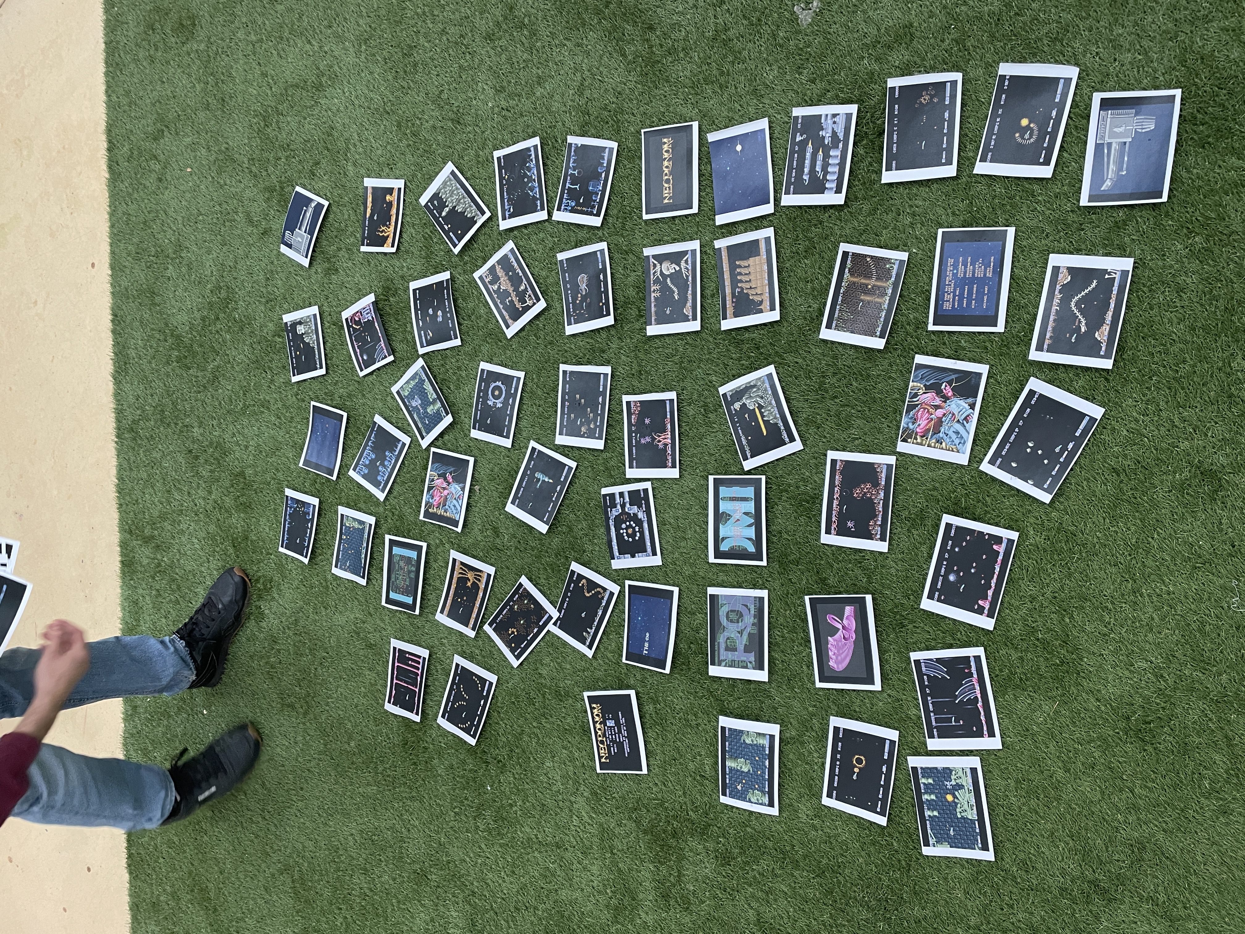
- Colors are generally muted, and a lot of black is applied. We have a larger brownish cluster, a blue and a greenish one, and pink seems to be reserved for the last level and the final boss (and the intro).
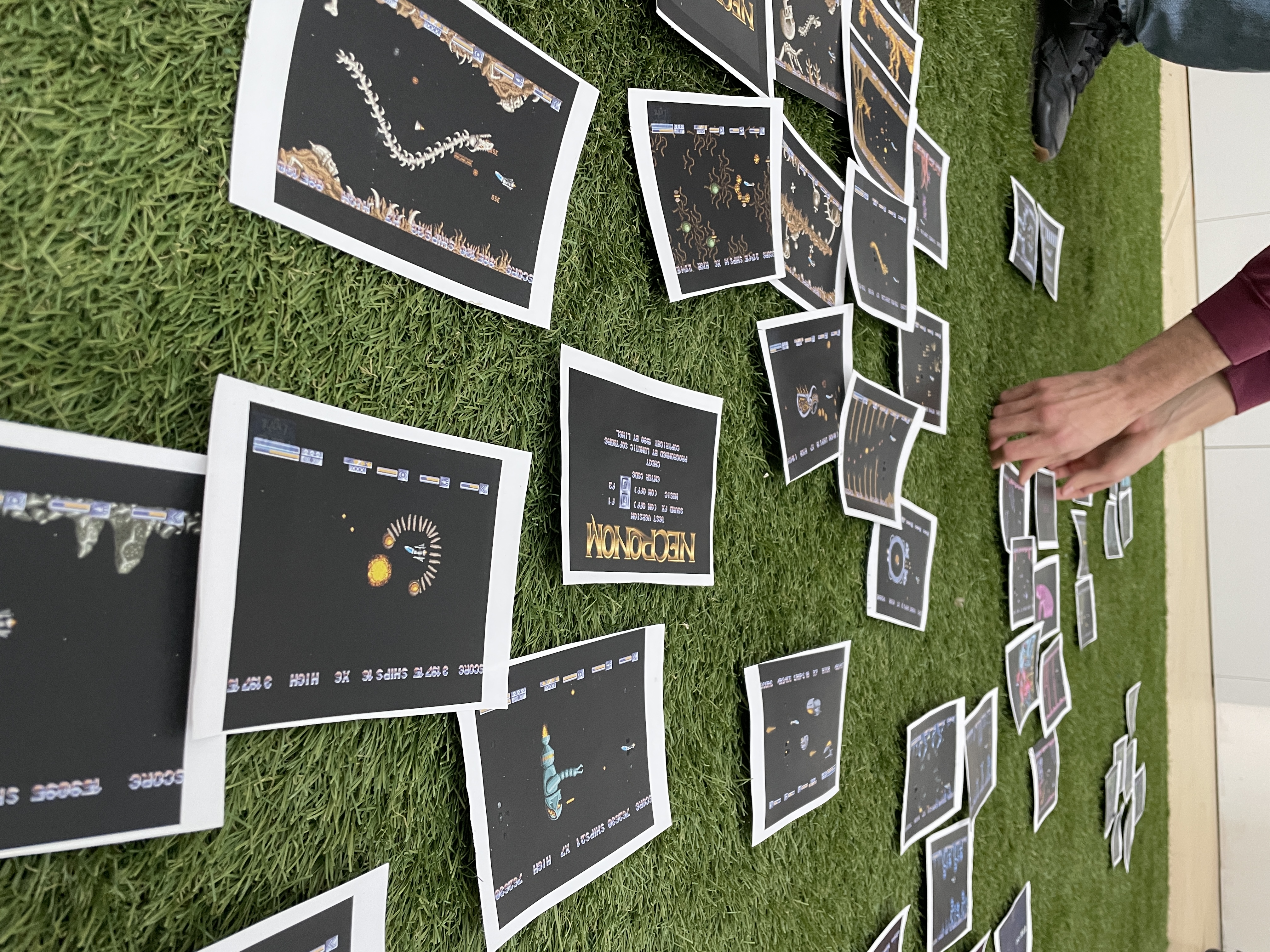
- We counted 10 different font styles! This might be, because different people worked on different parts of the “design” (intro, ui, outro, levels, etc). Some of the typo seemed fitting for the purpose, some of it just tried to apply a weird style.
- Some level designs and arrangements create pleasing visual complexity, while others seem overly constructed in order to create difficult levels. Most levels go with little background action, maybe a handful of stars. Some have patterns present, but it seems repetitive, only one breaks with the pattern in the background, leaving it appear only in pieces, to create something visually interesting.
- A few phallic elements can be observed, but all over all, for leaning onto Giger, very little sexualised graphics are present (maybe that weird alien egg boss).
- Very little “technology” is present, except for the ship configuration and level select and the hand that activates the user interface. Some levels feature technology, but they make up a smaller part. Most levels lean towards the organic or mix tech and organic shapes.
- The Moai statues seemed a bit out of place. Either they reference alien conspiracy theories (Gilles) or the use of Moai in Parodius.
- Some of the visual complexity is lost when looking at static images. Many actants in the game are animated, even if only so slightly. The intro-animation is just a blast and the parallax of the background adds to a fluid game play.
Log
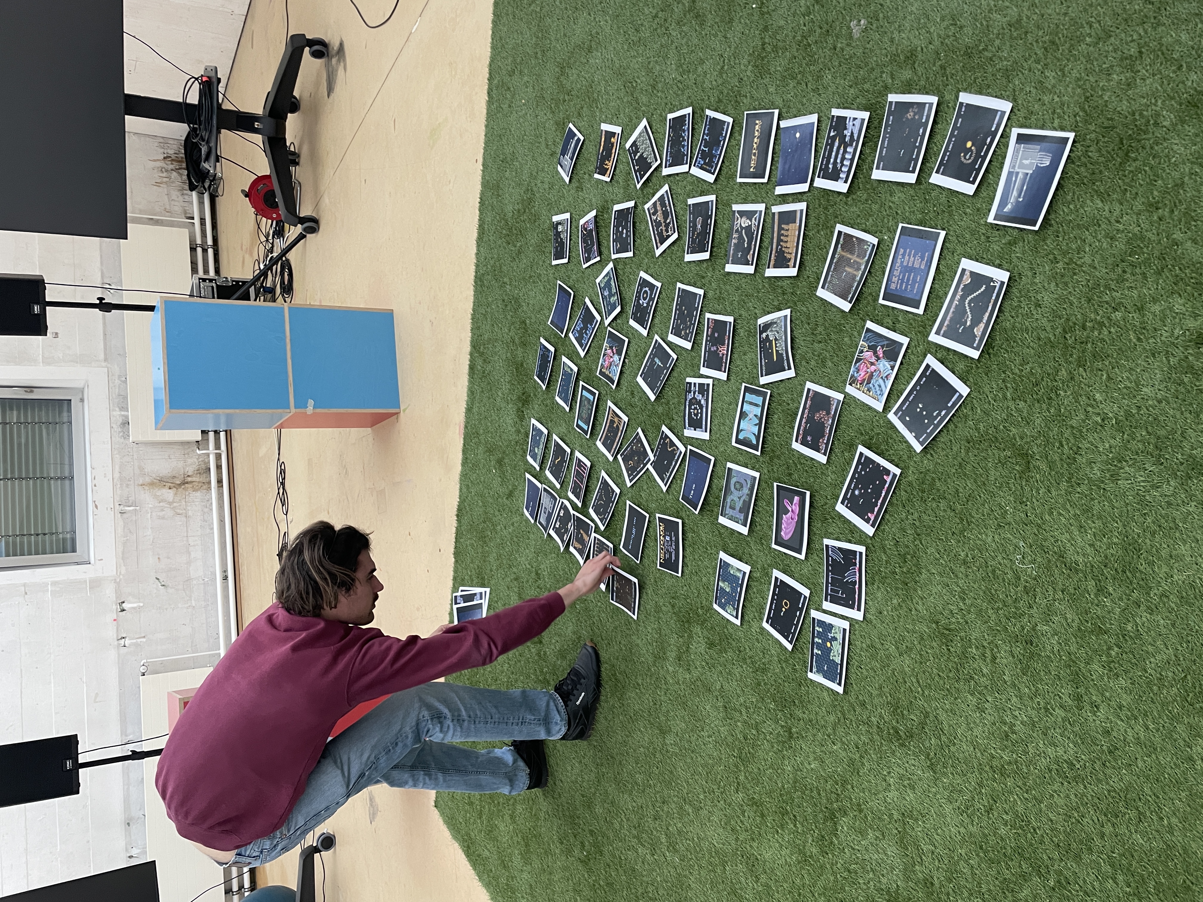
- Today I made the first phase of an Distant Viewing with Gilles for the Necronom case study. We printed around 120 screenshots from the game. For this small collection I decided to use the scrapped screenshots from HOL enriched by my own screenshots of the intro, the UI and the ending sequence. The material form HOL concentrated a lot on the levels and I needed some visuals of the typography and the user interface as well. Some of the preliminal findings concern the colors, the typography and the visual complexity of the levels.


