Distant Viewing Image Clustering of Video Games’ Screenshots
Log
2024-07-16
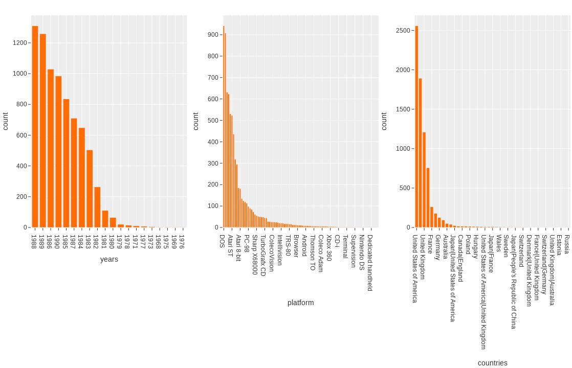
I run the clustering on a 10% sample of the overall dataset, which is equal to roughly 7360 images.
For the clustering I calculated two different embeddings with two different models and few different settings (base, tight, and loose layouts):
resnet101-imagenet-torchdinov2-vitb14-torch
When doing the manual (qualitative) analysis of the clustering, I proceeded as follows:
- Check global form
- Manually check clusters for formal similarities
- Manually check oddities in global and local structures
- See what automatic clustering-detection brings forth in terms of global and local structures
The resnet101 layout was generally pretty packed, in all layout settings, and when trying to loosen it up, became full of holes. The edges and oddities along the edge stayed very interesting, but the clustering inside was a mess and difficult to explore. I tried to see what I can identify along the rims of the layout.
My quick notes:
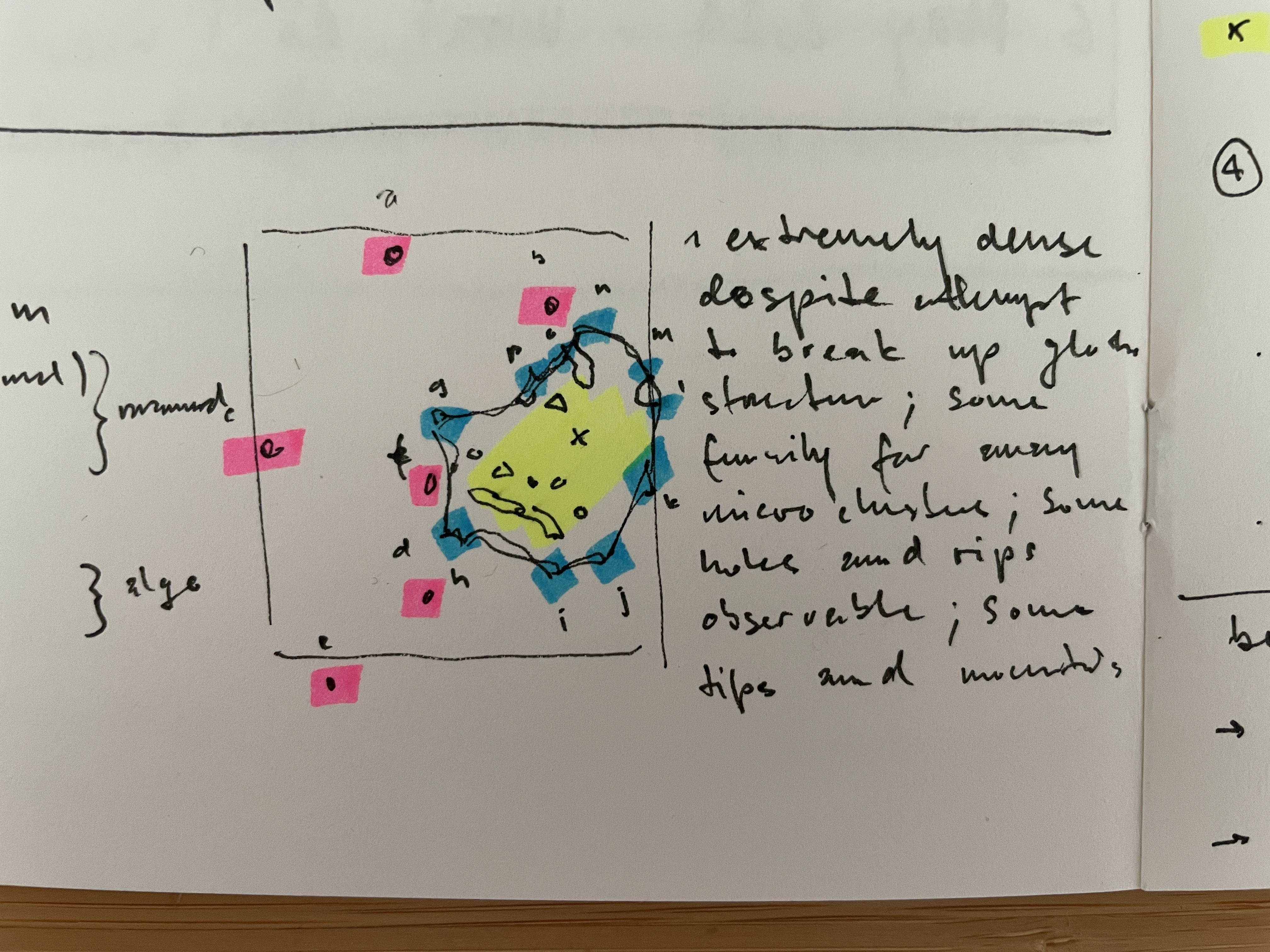
- a. photo realistic wrestling b. hexagons c. green forest d. white text on green/black e. white on blue f. same, but messy; some graphics
- g. like d. but messy; some graphics h. like d. but messy; some more graphics i. white on black title screens j. low poly vector graphics with few colors k. few colors, mostly yellow; 8-bit graphics l. racing games m. fighting games n. probably Amiga games o. portraits; many colors p. black/white illustrations
- x. there are plenty of interesting clusters to be found here, but it takes time, and it’s a messy process
Notes on the automatic cluster-detection for Resnet101:
- the tight clusters are well-ordered, but often it is challenging to see formal similarities within them; works fairly well for the edge of the global structure
- loose clusters are messier and mix a lot; makes for some surprising discoveries
- the embeddings cluster are all over the place
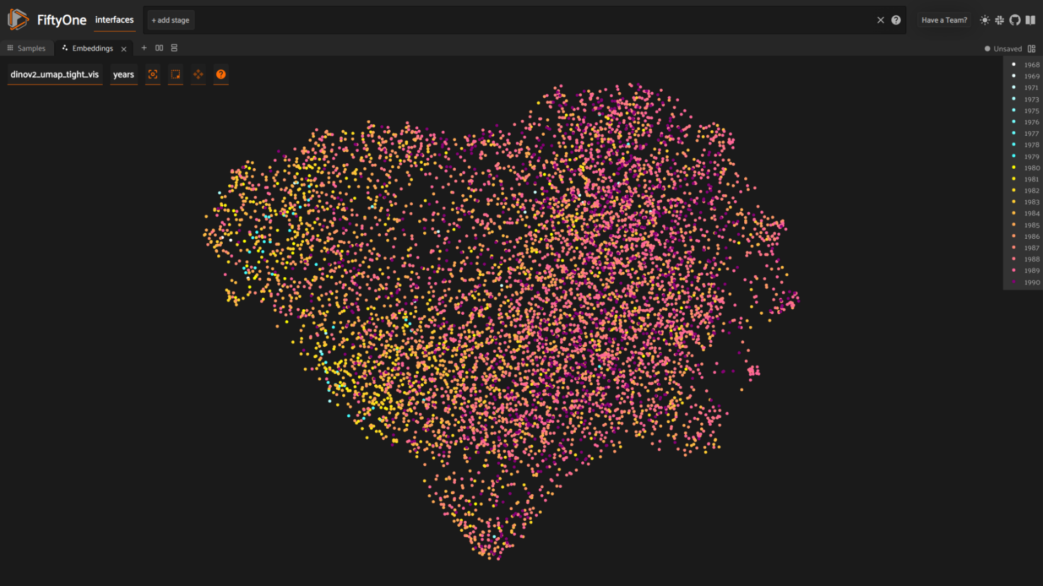
I also did check the visualization along platform and year of publication. Whereas platform wasn’t very interesting, year showed a clear trajectory, which was to be expected. Nonetheless, pleased that it showed up and indicates that the visualization can be of value.
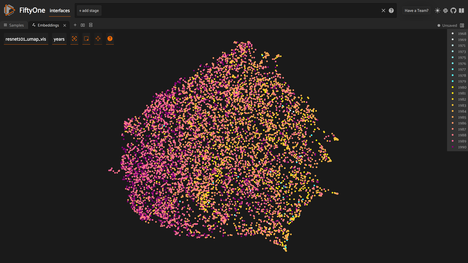
Besides a lot of noise, a clear gradient between 1990 on the left and 1968 on the right appears.
Today I only worked through the Resnet101 clustering. The Dino-v2 looks way more interesting, and I will go through that one next. I also need to generate some more basic questions through which I can read the visualizations.
2024-07-17
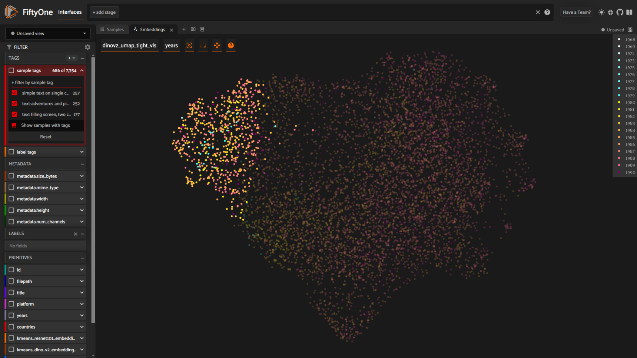
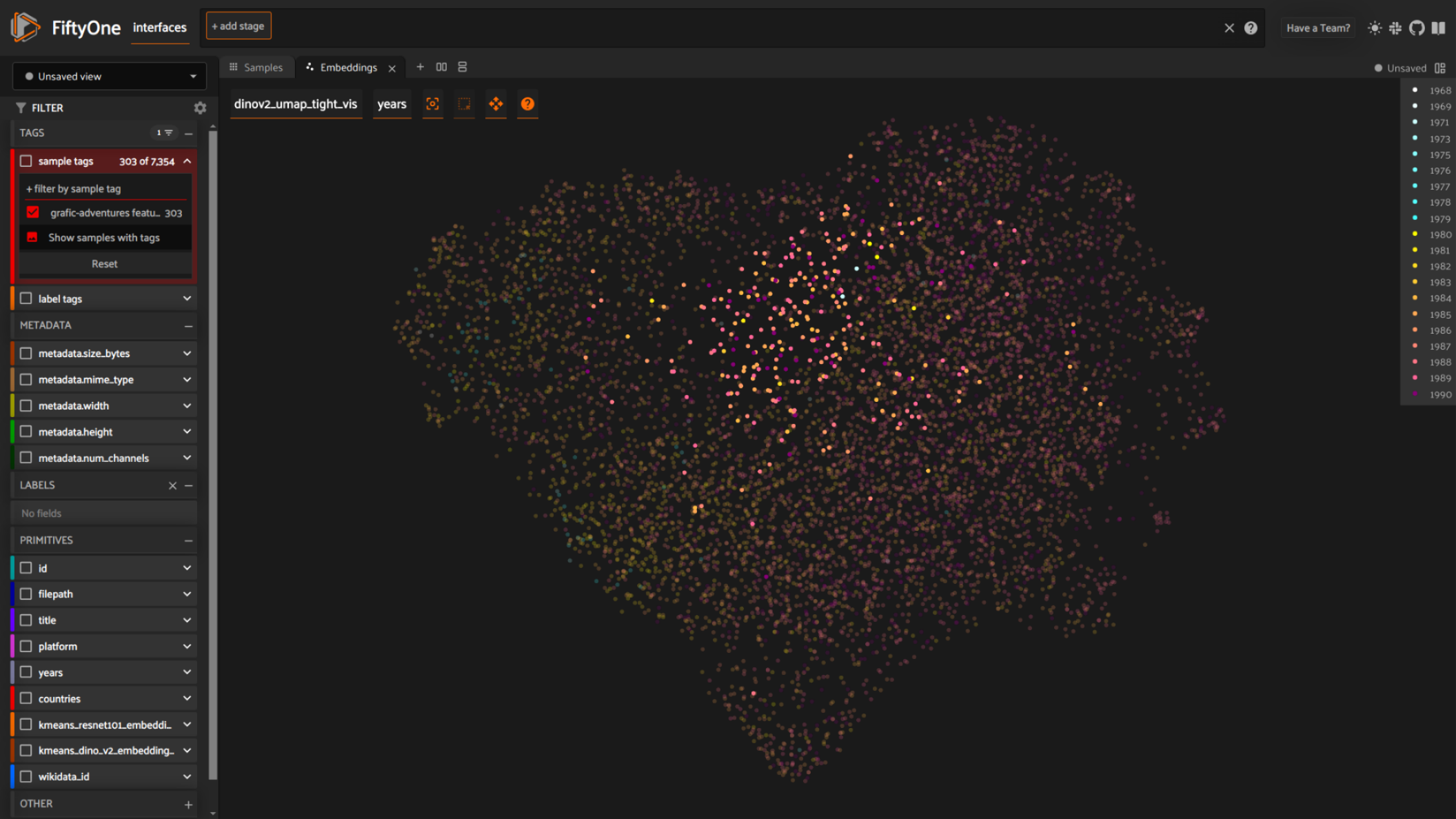
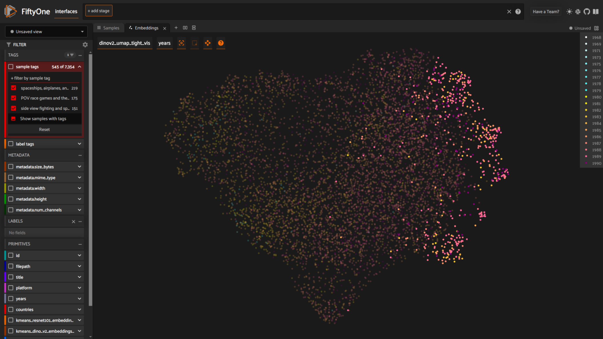
I started looking into the Dino clustering. The global layout, as well as the local structures are easier to read and seem more interesting then what Resnet was able to produce. I also did a automatic cluster discovery with kmeans on the image embeddings. After I went through those clusters and gave them a label. I chose whatever came to mind after skimming the samples of the cluster. This resulted in the following list (number of samples, cluster label):
- (550) houses, platformers, and isometric perspective
- (446) green, landscapes, and historic buildings
- (391) top- or sideview with squarish patterns
- (383) level-designs leaning towards jungle, or organic forms
- (375) full screen illustrations leaning towards fantasy
- (371) in-game views of people and inside rooms
- (364) various games and genres in birds-eye perspective
- (353) low color mazes and squar-ish levels
- (345) menus, score-boards, full-screen messages
- (324) big HUDs, traditional board and card games
- (309) space-ship levels
- (307) low-poly vectors, diagonals, primitive POVs, few colours
- (303) grafic-adventures featuring portraits
- (302) full screen portraits
- (261) very simple blocky levels
- (259) big font title screens
- (257) simple text on single color background
- (252) text-adventures and pixel fonts
- (243) maps
- (237) decorative font title screens
- (219) spaceships, airplanes, and tanks
- (177) text filling screen, two colors
- (175) POV race games and their HUDs
- (151) side view fighting and sports games
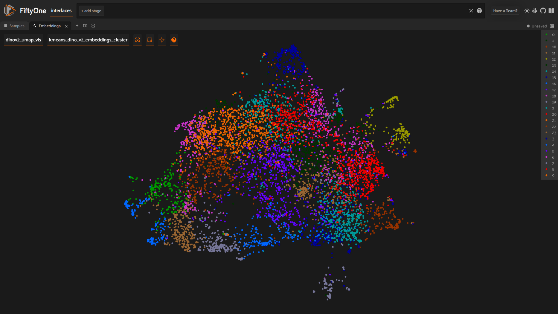
The date of publication gradient, already seen with the Resnet clustering, is visible here as well. Especially so in the tighter layout that resulted in this nice heart. On the left we have 1968, transitioning into 1990 on the right.
The Dino loose layout on the other hand is a bit too dispersed and not as usable as the UMAP cluster layout without and parameters. As expected, the samples featuring mostly text are on the left, whereas the grafic-adventures take place in the middle and participate in the transition.
Games with more action, such as side-scrollers or race games are to be found on the right.
That said, there are of course a lot of exceptions. The transition from text only to action-games is only loosely associated with time. It is nonetheless there as a general indication.
After some more digging I figured that local clusters where year of publication diverges a lot could be of interest. To test that I created the following three clusters.
- (143) isometric perspective
- (39) nsfw and nazis (which uses large illustrations of portraits and people)
- (12) hexagons
The cluster with isometric perspectives is fairly large, and spans from 1980-1990, making this point of view an interesting case. Isometric views are fairly easy to construct, but offer a lot in terms of game graphics/aesthetics.
2024-07-18
Notes on the global form in the Dino layout, as well as global oddities.
- Several smaller clusters are to be found on the side with more recent year of publication. Could indicate the diversification of visual styles.
- For older games, late 70ies and early 80ies we have two entry points: text only, whereas the background has one color only, and a visual design made through large uni-colored rectangles; in between these two modes there is a transition zone with games in the early 80ies.
- It’s interesting that the hexagon island is isolated from the global structure, but situated in between mazes and maps.
- There is a larger hole in the bottom center of the layout. It’s framed by screen featuring mostly text on the left, graphic-adventures on the right, title screen on the bottom and full-screen HUDs (or screens seeming like that) on the top. It seems that those are four modes, that don’t have a fitting visual gradient in between them.
- Dino is very able to distinguish what FAVR calls modes, although sometimes mixing them up a little, like the case of the fullscreen HUDs
On the side of older games from the 1970s and -80s we have two interesting oddities. A larger peninsula with text-only images. The background is usually unicolored and the running text uses one fontstyle covering most of the screen. A bit further up we have a smaller peninsula that consists of images featuring video games with a visual design made through large rectangles and few colors. In between these two modes there is a transition zone with games form the early 80ies, pivoting from text into very simple graphics. Several hotspots breaking from the global structure are to be found on the side with video games with a more recent year of publication. This is indicative of a diversification of visual styles as well as complexification of the video game image.
2024-08-12
I run a clustering over the complete dataset. The global structure tends to either be overly dense or create meaningless microislands to quickly. Maybe I need to try a few settings to find a better balance.
- happy to see the isometric perspective hotspot be present again, although slightly messed up with graphics hosting 60/90° diagonals
- the overall time gradient is again present
- the dataset is quite biased in year and country, and it’s unclear if there just aren’t more games or if the aren’t enough entries on Mobygames for a year
I also run a kmeans hotspot detection with 64 hotspots. Some of which are: